Friday 28 December 2012

Website Update

In this update we added our own custom arctic monkeys logo that we created in Photoshop by warping individual letters, this made the logo look like a real Arctic monkeys logo giving the site more authenticity.
We added a screen shot of our own music video into the website over the YouTube window so that we could know how the color would look in a black and white website, we feel that it will fit as when the video is playing all attention will be on the video and not on the site and the reverse when the video is not playing.

final digipak and website

For the final website we tried to make everything line up, this was to get uniformity to the site it would also be more user friendly and aesthetically pleasing, we also made the the band profiles into a gallery so that they would be linked and have a roll over, this will make it easier for the audience to use. finally we made our custom arctic monkeys logo centered and to a suitable size so that it makes an impact but doesn't distract the audience from the main page. The web address is as follows:
http://ryancoryaaron.wix.com/balaclava


We have decided to make the bar code more realistic and made more lines with varying thickness to make it look more realistic for the audience. We also added in the record labels logo and some details of the coppyright, year and PO box, this was made to make the album look much more realistic and familiar to the audience.  We also added a  parental advisory warning on as some of  the tracks has explicit language in them.


Tuesday 18 December 2012

Evaluation Question 1 - Aaron,Ryan,Corey


By the same artist

The camerawork in Fluorescent Adolescent is constantly moving around to keep to the fast pace of the video i decided that this would be something good to use as stationary shots would be boring and hard to match to the music. The video uses lots of Long shots, Mid shots and Closeups these where all used well, the long shots where to show the scene and multiple characters, the mid shots allowed for character interaction and the closeups where all focused on characters faces, we decided to use this when we made our music video so that it had the Arctic Monkeys "feel".

The editing was extremely fast with the average shot lasting approximately 1 second and some shots only lasting a few frames, this creates a fast and fluid feel to the video and matches the music in speed but also beet editing, the beet editing changes from time to time from the drum hits to bass picking but is seamless and works well without the average audience noticing, we wanted to have small amounts of beet editing as we wanted to focus the editing around the narrative, but we used beet editing to link between hard cuts.


There is also a small section that is lip synced perfectly, this was something that we wanted to incorporate into our video, but keep a good balance between lip sync  performance and narrative. The colour grading in this video gave it a moody grey and yellow look, we wanted to use this in our video to make it seam darker and moodier  like a typical arctic monkeys music video
The Mise-en-scene gave us some inspiration for our video, The location wasn't something we wanted to use but the very low budget seeming location influenced our use of the streets in our own video, it has a British feel because of the industrial location they have used, we couldn't find somewhere like that so we tried to use something that would have the same feel, this is where the streets idea came from. The moody weather and moody colour gave us an idea about the colour we wanted, we wanted to have a similar look from the weather but the weather was un-reliable for when we shot so this will be fixed in post production.

The narrative of this Arctic Monkeys video was not something that had a significant impact on our narrative, we wanted to have something that had some dark humor like in Fluorescent Adolescent, but we found this hard to do as we wanted to keep it realistic but we have some clips that might come across as funny but we will have to wait for feedback. 


Same Genre

The camerawork in Don broco's Priorities uses allot of mid shots to allow for all four members of the band to be all in frame at one point, this influenced the section of our video with all four band members behind a wall, it was good framing and didn't look out of place. We also took inspiration from the panning around and moving camera, i found this allot more interesting than music videos with stationary shots.
The editing in this is slower than in Fluorescent Adolescent and our video, this is because the song is slower but this video is mainly done to beet editing to the bass drum hits, this makes it run smoothly, this was a helpful video to understand beet editing but the editing didn't inspire our video but did help us understand beet editing.


The Mise-en-scene in this video in terms of location is a very big hanger  this is a good location in terms of space for the band, equipment and crew but wouldn't have been suitable for the look and feel of our video. the costume for this video is very casual, we used this as it was a convention of indie rock videos but was also featured in this video, the masks used in this video also inspired us as it was a disguise for a robbery  we decided to use masks but not the masks used in this video as it wouldn't have worked in terms of narrative.
Some aspects of this video inspired our narrative as it was all to do with a robbery, we decided to use some aspects because the narrative of the song "Balaclava" linked in nicely, we tried to use some ideas from the chase scenes especially the slow motion clips.


We took idea's and inspiration for the sections of the video from many music videos but mainly the don broco- priorities video, this look and style we wanted to achieve is featured in many indie/rock videos. This convention of closeups and long shots makes all the videos it is featured in faster in pace and much more interesting than videos without the interesting.
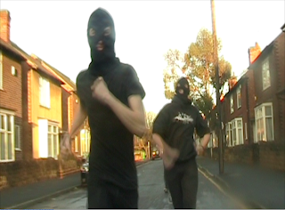
This look was not inspired by any particular  music  video but was inspired by TV shows like Top Gear, I sat in the back of a car holding a steady cam rig, we went at a speed slightly faster than the subject, this was an indie film-maker technique that i have picked up from Top Gear and other TV shows.


Close up's are a very common  convention in  indie/rock music videos, we wanted to follow this convention as it would make the audience see it as familiar but we wanted it it to stand out from every other music video, to do this we had the camera at canted and "odd" angles, this made it look very different from other music videos but not make the  audience feel too odd about what they are viewing 
 This shot is a 180 degree pan around out lead Singer, this made the shot look much more active and interesting than if we did the shot still on a tripod, this is not a common convention in indie rock videos, i have not seen this in any indie/rock videos that i have researched.
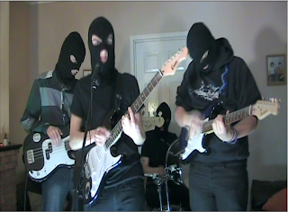
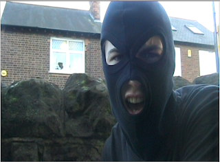
This  shot is a close up lip sync is something that is very common in indie/rock music videos, this will be very familiar for audiences but will not be the same as everything as the singer is in a balaclava and not normal  

Friday 14 December 2012

Digipak edit 14/12/12


Since the last post we feel we have done the remaining editing effects needed to make our digipak that you could find in the shops. On the front cover we have replace the Arctic monkeys title with the logo we made ourselves, based on the original monkey's logo, and also after looking at the back cover we decided to darken the shadows with gives the front cover a more of an moody, edgy look. We also moved the balaclava so the top of the l's and b are on eye level with the two pictures.

On the spine we wanted to keep it simple so we made the back of if black and used the same font as the  one used for balaclava on the front and wrote the album and band name.

The back cover we used the idea of it being at the police station and having the 'balaclava case' as a top secret file, we kept to the theme of the digipak and website and made it black and white and on the cover of the file we added the song tittles that would appear on the C.D.


On the inside we kept with the black and white theme and used portrait shots and used the same effect on these as we did with the front cover and then merged them together and softened  the edges to stop them cutting each other out.

We just placed a black strip where the spine would be as we feel that it would be too tedious to try to put anything there and also no one looks at the inside of the spine, so we went for simplicity.

For the actual CD we wanted this to be also simple but easily recognisable too witch is why we decided to have the CD black with the album and band name wrote on, we used ideas from existing CD's and digipaks by having the text not fully fitting and cuts at the edge of the CD. We decided to keep the back ground around the CD simple and a light grey to make the CD stand out more.


We feel that with some minor adjustments this will be our final digipak.


Website Final Design

we shrunk the logo at the top of the page so that it looked better and wasn't drawing attention away from the rest of the page, we also made  better use of the space on the page, we made the size of the video and the the bar above it smaller so that we could get more into the page without making it look crammed. We also made the band images into a gallery so they would stay at a uniform distance apart, then labeled them bellow, this saved allot of space and makes the page more compact and look alot better.
We replaced the CD in the Merch store with the album we have created, this felt more fitting and allow us to link our products together, we also made the twitter feed longer and brought it up inline with the merch store so that it all looks uniform.

Now that the whole website is done it looks allot better than every iteration before, this is because of the changes we have made to make it look similar and link it all together with the black and white crime theme and having the cops and robbers theme.

Wednesday 5 December 2012

Progress Report 30/11/12

Up to this point we have:

. Almost completed the website
. Started Digipak editing
. Shot and Edited in the performance part of the video
. Organised second shoot
. Completed planning
. Planned all ideas for shoots and album cover

Sunday 2 December 2012

Creating the police office costume

To create the police officer uniform I tried to replicate the image in the middle, Firstly i took the police tape we took a picture of and removed the white background, we made one A4 sized one to go on the back and scaled down version for the front. To replicate the checkered image i crated 1cm by 1cm squares and alternated between blue and white, this image is made of 51 layers.

We cut these images out and stuck  the images on the reflective jacket


Website Banners


We have decided to change the side banners on the website from the white and blue police tape (right) to black and white to match the rest of the website. We have two versions of  the banner so far, the left one had a Black and white effect in photoshop then dropped all the blues and greens and raised the yellows and pinks and kept the reds neutral as they where not present in the photo, doing this made the banners look more natural in black and white but the the white was too dark and grainy. The second banner had the same effect applied but then a curves effect applied, i bumped up the whites to make the white look brighter, this looks better and brighter but very un-natural.

To find out which one is better we will have to make a poll and get audience feedback.


Second day of shooting

Today (1/12/12) was our second day of shooting, we decided to film all of the narrative today as we didn't need all the musical equipment,  we also decided to do this during the hours of 1 and 4 pm so that we would get the most sunlight during winter time.

We firstly re shot one of the items being stolen due to the continuity error in the first shoot, we found a location in the house that hadn't appeared in the shoot before so that there was no errors

then we decided to shoot the opening scenes, we asked my next door neighbour for permission to jump over the hedge that connects our gardens, he agreed so we filmed as quickly as we could so that we didn't disturb him too much. we needed to keep the band in the order that they came into the house to keep with continuity.
Once we had shot the opening we shot everything else after the beginning instrumental, we shot the band escaping the house we firstly filmed this and made the band run past the right of the camera, but we realised that the remainder of the shoot would get allot of glare from the setting sun at the end of the street, so we re shot them running to the left, this created another problem because there was allot of cars on that  part of the street, we decided to add a new shot, i sat in the back of Corey's car boot so that we could get a steady shot of the band running towards the camera, we decided to do this shot even though it was not planed because this has been a common way to shoot a running to camera scene.

The last scene was slightly difficult to film because of timing, for this scene I was operating the camera, Ryan was directing the actors for timing purposes and Corey was working with Matt (lead singer) for musical timing and lip syncing. For the first few takes Paula (Police officer) was going too fast for me to keep up with and sometimes covering the camera with the balaclavas. 
 One of the difficulty's with removing one balaclava and revealing one underneath was that the underneath balaclava would sometimes come off or move over Matt's face and ruin the ability to lip sync, we firstly tired to pin the lower balaclava to his t-shirt but i realized that  this could ruin the t-shirt if Paula pulled too hard, so we used a hair bobble to tie the balaclava tight and tuck it under so that it wouldn't pull off.

Overall we believe that we have filmed everything now, so all we need to do is eddit.  


Friday 30 November 2012

Digipak editing 30/11/12


We have started to create our ideas for our digipak ad today i have been focusing on using the images taken from the first shoot to create different parts of the digipak.

Front cover.


We decided to change our original idea to this from the two sides making up his whole face as we felt this looked better and was more easily edited into place so is simple yet effective.


We decided to align both sides of the faces eyeline and also bring down so the balaclava sits on the same line.

This is our idea for the inside cover based on previous students work and existing digipaks we have a white box as we was going to use this as the back cover but decided against this.

Editing summary and details of December shoot


Today we finished editing the performance side of our music video, we are planning to do our next shoot on 1/12/12 where we will be strictly focusing on the narrative side. This will be our final shoot, from then on we will be able to perfect the performance as well as adding the narrative in relation to timing.

Wednesday 28 November 2012

side photo edits


we feel the blue on the police tape for the side of the website now is too bold and stands out too much, we have now decided to try and edit them to make them fit in with the grey scale theme of our website here if our first few attempts the we wish to perfect.

theses are both edits of the right side of the website and once we agree on a final edit we will apply the same to the other side.

Website design 2


Since the last post we have added the mecrch store and are trying to find appropriate images to add and made images relevant to put at the side and also changed the band bios link pictures to the members. We also changed the top image and added the band logo to be replaced by one we make ourselves we have decided to make our own band twitter feed. I also changed the text in the latest news to make it relevant to the band and website.

weather forecast for second shoot


This is the weather for Sat 1st witch is the date we want to film and the hours we wish to do so look good enough to let us film our narrative.

Sunday 18 November 2012

Edditing 2

Today we took a second try at editing, firstly we went through and reviewed the footage that we had started on last time, we found that one clip didn't match up to the music, we found another clip that had the timings to match the music, we cut this down to size and added a very slight speed effect to it, we found that this made it flow allot more fluidly but didn't stand out as looking altered to changed to the audience.

We also did some frame removal towards the beginning and end of clips, one or two removed frames made it have a much better sync to the music

As we haven't filmed everything at this point we decided to create place holders for the narrative sections and anything we need to replace, this has made the time line easier to work on and made it a lot easier to visualize, it has also helped slightly with the problem i mentioned in the last post about when clips where deleted everything shifted, the place holders stop clips drastically jumping all over the time line.

Thursday 15 November 2012

Editing first try

Today we started editing together our music video, we firstly went through looking at all of our footage and breaking it up into manageable clips and putting them in order as listed in our written story board, this was so that we would not get confused or mistakenly put a clip in at the wrong segment.

After we had all of our clips in order we dropped the song (Balaclava) onto the the audio track then locate the first clip that could go onto the video track, we started with the performance sections adding the the clips in one by one, we made sure that we had the music playing on the day of shooting, this made it easier to sync  the audio track with the video clips, once we had our clips lined up we went through to double check that the audio and video synced up nicely, we did this by removing a couple of frames of the clip, this made the video clips look like they actually line up with the song.

We got many of the clips in order and cut to the right length but some of them needed extra cutting to make them transition better between jump cuts of the clips, this made the whole video look better, but sadly this made everything shift to the left or right, this is a problem in Imovie that we will have to work around, we discussed how we would work around the problem, i thought that we would be able to export  the film each time and edit around the exported clips but i realized that we would still have the same problem if we needed to re-edit the exported clip.

We also found a small continuity error as we didn't film in chronological order, this was to make it easier on both the cast and crew, we had an item that was stolen for the film but was shown  in the the performance section this will have to be altered, instead of re shooting the whole performance will change the item that gets stolen 

Monday 12 November 2012

The first shoot 10/11/12

 For our first shoot we had planed to do at least  80% of the full music video, sadly this wasn't possible because of our actors not having enough time and the posiblility of not having enough light to film outside with

Throughout the day we all took on different rolls such as cameraman director we all also had to check for continuity. In the photo above you see Corey using the camera on the steadycam rig this was his roll for that particular scene. In this scene both me and Ryan where  directing  the cast, out of shot is our written storyboard, we used this to line up the music to what visuals we would see.


This photo is showing our band set up during the performance, the band is well lit in all the performance sections, all the light comes from two floor lights shining up on Matt (lead singer) as he is the main subject, the tall lights in the previous scene are used to light the other band members, the white light is shone directly at Simon (rhythm guitar) and the yellowish light is bounced off the wall on to Ronan (Bass) so that it is defused and not as strong.


We also took the opportunity to take band photos and individual photos for the website, we have multiple photos so that we can chose the best fit for our website


I also took the opportunity to do a first draft Photoshop for our bands CD cover  there where a few problems with this but i will cover it in a CD cover specific post.

Friday 9 November 2012

Website Design 2

This is the banner we are using the existing band logo, we plan to make our own logo and also to replace the image with one of our band from the video.


we took inspiration from fall out boy to make band member profiles on a separate page with links using photos of each band member, we do not have the images yet as we will be taking them on shoot but we have put the links in ready.


we took ideas from the existing template to have upcoming tour dates and live feeds from the bands twitter page. We also introduced small icon links to other social sites such as facebook, twitter and youtube, we will attempt to customise the links to relate to the rest of our products

Wednesday 7 November 2012

Website design 1


We have made a start on wix and we have started experimenting with the different tools ready for when we actual make a start on creating our website, i found some of the software very hard to use but do believe it will be a good basis to start our website from with some good templates to work from.