Showing posts with label ryan. Show all posts

Wednesday, 30 January 2013

Planning Documents

This document summarises our intended target audience; with this we can analyse their social class subculture and sexuality. This will allow us to make sure that our final music video creates links to our target audiences views on this form and increasing the chances of them to have a positive response on the film.

We used this to evaluate the past students work, we wanted to see there strengths and weaknesses so that we could learn from them and implement it into our music video, this was extremely helpful as we could see what we could achieve and what we should avoid during production

Friday, 25 January 2013

Question 3 Aaron - Ryan - Corey


we found the most effective way of gathering audience feedback was to carry out screenings of our video to our target audience and encourage them to fill out a feed back form / questionnaire, to record their views.
We chose this method as it was the most simple and effective way of gathering information and also the results was collected almost instantly. We attempted to carry out other methods such as Survey Monkey but the responses was very limited. Our findings overall was as follows:

Question 1. Did you enjoy the music video?

The feedback from this question was heavily one sided where the majority enjoyed the video. This question allowed us to understand whether our song suited tastes both within and outside of the Arctic Monkeys existing target audience.
(Graph shown below)


Question 2. Did the video show any similarities and/or differences to previous Arctic Monkeys music videos?

This question allowed the audience to elaborate on their answer by offering them a comment box, the general feedback was fairly positive where it related to previous videos made for the Arctic Monkeys Where one viewer said it held close links to Fluorescent Adolescent (Previous song made by Arctic Monkeys). Three viewers had said that they wasn't too convinced at the idea of it being related to past videos made by the band but no one outright said there was no links nor similarities.


Question 3. Did you understand the Narrative

The response from this question was generally postive where all of the comments stated that they could understand the majority of the narrative. The people that understood the video was also the same viewers that enjoyed it,


Question 4. How could we improve our video?

the feedback from this question highlighted some of the weaker points within our video. 7 of the 9 people had commented on the syncing making the instruments and singing unbelievable/ unrealistic and thus making the video seem staged. This was because we played it through a overhead projector via the internet; this caused the sound to run at its normal speed however the visuals on screen was slightly behind, if we'd have shown it  on a computer screen we would have had less responses of this type. The other responses stated that there needed to be more narrative singing, we could have done this but due to the upbeat nature of the narrative and the cast running this would have been difficult therefore reducing the quality of our video, so we decided against it.

Question 5. Did our video flow? was there clear links between the performance and narrative?

All of our feedback for this question showed that they all thought there was clear links between the performance and the narrative. This was mainly down to the instruments in the house where the narrative allowed the performance scenes to make sense and link together. Other viewers stated that the timings of editing allowed it to flow effectively between the performance and narrative.

Question 6. Was there any scenes or clips that you didn't like?

7 of the 9 people that answered said that there was no clips or scenes that they didn't like, one person had commented on the fact that the clip where the police woman shouts "crime!"there is a beam of light this is inconsistent with the rest of the film. this is because of the multiple days of filming with changing light and weather. One person said that they didn't like how the lead singer was singing towards the camera, this was not a backed up criticism so we are unsure why they didn't like it.

Question 7. What would you rate this video out of 10?

we got high scores for this question, this question links heavily with question 1 but gives us a much more specific answer. We think that these scores are based on the performance pieces whereas the lower end of our scores are due to some of our viewers not understanding the narrative.


Question 8. Does the song suit the performance and narrative?

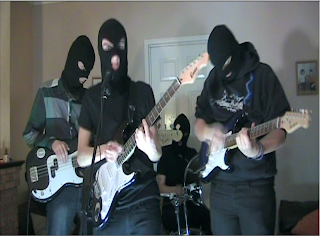
The responses was all positive for this question, this was mainly because our band members for the music video was all wearing balaclava's. This allowed the whole music video to have clear links and present a clear understanding to the audience. The narrative, although being confusing to some viewers was highly rated by others, they felt that it suited the arctic monkeys style and is a good representation of their professional products.

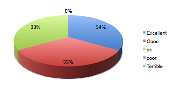
Question 9. Has the lip syncing and instrument syncing been done well?

The responses we received ranged from "Excellent" to "ok" so i all a very good set of feedback. Even though the conditions where we presented our music video wasnt ideal, the audience felt that our editing was effective and made our video flow and allowed it to be believable.


Question 10. What are the videos strengths?

Judging from the feedback received from this question we found that most viewers liked our narrative and how it was integrated into the video was effective. The various shot types maintained the audiences interest and allowed the video to be entertaining and interesting throughout. The viewers also stated that the cast members was enthusiastic and lively about the video and this was evident in the final cut of our music video.


Overall the viewers felt that our music video was a good video with small flaws. It was a good attempt at portraying the Arctic Monkeys where links between our video and professional videos (e.g. fluorescent adolescent) are evident. After consideration we have decided that if we was given the time to perfect our music video we would change:

- certain scenes regarding instrumental syncing
- Scenes in slow motion that break the flow of the video (Drumming)
- Include more shots of the lead singer sing to camera

We did not use certain feedback from particular candidates because their inexperience with the arctic monkeys made them believe that our music video was flawed because of certain aspects that are linked with the arctic monkeys professional videos. For example some couldn't understand the narrative as well as the viewers that were more familiar with the band already.


Wednesday, 23 January 2013

Question 2 - Aaron Ryan Corey


 Question 2 


How have we maintained a clear image and theme throughout our campaign?

throughout our media project we have tried to keep to Arctic monkeys sinister and dark themes portrayed in other professional music videos such as "fluorescent Adolescent" and Don Bronco's "priorities".
For our website and album cover we decided to keep a black and white theme, this gave it a dark noir feel to the whole project and allowed them to flow together effectively, however we decided not to make our actual music video black and white because we thought that this would ruin the look, so we used colour correction to make it darker (To maintain the themes) rather than the black and white effect.


How is the website, CD cover and video interrelated? Do they have the same purpose?

We created them all to not only sell their products but their style too. we did this by sticking to a simple but constant theme of Arctic Monkeys and black and white while showing indications of criminality and police influence, This was achieved by using police tape and Balaclava's as props and cosmetics. By integrating the music video and the CD cover on the website it allows the target audience to find all the information needed about the band, thus making it an effective advertising tool. 
The CD cover shows images and links to the main music video (Front Cover) allowing the target audience to identify the CD easily and promote the end product.


What purpose or relationship do they all have? Do they target the audience?

All 3 of the media products aim to promote and sell the bands image and music, they all show a common mise en scene through their dark and sinister colour scheme. They also relate to one and other as both the Digipak and the music video are embedded into the website.
They target the audience effectively by keeping to similar themes and conventions made popular by the arctic monkeys. As the media has shown our  target audience as violent and aggressive, the theme of our media product fits in well with current perceptions.


The six images above are screenshots from our final music video, this again shows a dark and sinister theme evident in both the Digipak and the website and is a clear example of how our media products link together.


How do these promotional materials sell their artists?
How do they compare to the products that your group produced?

The Arctic Monkeys Digipak highlights the normality of the band to the audience, it also shows how they wish to be perceived. unlike most modern day artists these prefer to present themselves in a way that is similar to their target audience and do not highlight their fame. This is effective because it will encourage the target audience to respect and relate to the band. Both Digipaks use a black and white colour scheme to show a more sinister side to the music and expresses the genre.
The You Me at Six Digipak carries this image through the image shown on the front cover. This suits our media products because we have selected similar themes (Criminality and violence) and has allowed us to create a digipak similar to those in the music industry of professional quality.
The two Digipaks shown hold similarities and differences to our products:

Similarities
- Black and white / Dark theme to suit style of band and genre
- Criminality / drug use evident in Digipaks
- Dark / plain costume throughout
- emphasis on the darker and sinister side of individuals

Differences
-  we incorporated our band members in the Digipaks
-  we kept a plain and simple CD compared to the arctic monkeys digipak
-  we have direct links to our music title


Question 4 prezi - Aaron,Ryan,Corey


 this is our prezi to answer question 4 of our evaluation questions

Thursday, 17 January 2013

Survey for audience feedback

http://www.surveymonkey.com/s/K5HBW5G


The link above shows a survey i have completed for our target audience so we can see the strengths and weaknesses for our video. once we have collected all our responses we will review them and see where we can perfect our video

Wednesday, 16 January 2013

Editing update 16/01/13


Today we have finished the editing of our final film by filling the remaining spaces with our reshoot films and also darkening clips using colour monochrome to make the film take on a darker tone to fit our other products. the images above show the before and after the colour monochrome effect was applied the lower images are obviously darker making them feel moodier like our website and CD cover but also is similar to the previous arctic monkeys videos.

final music video


Friday, 28 December 2012

Website Update

In this update we added our own custom arctic monkeys logo that we created in Photoshop by warping individual letters, this made the logo look like a real Arctic monkeys logo giving the site more authenticity.
We added a screen shot of our own music video into the website over the YouTube window so that we could know how the color would look in a black and white website, we feel that it will fit as when the video is playing all attention will be on the video and not on the site and the reverse when the video is not playing.

final digipak and website

For the final website we tried to make everything line up, this was to get uniformity to the site it would also be more user friendly and aesthetically pleasing, we also made the the band profiles into a gallery so that they would be linked and have a roll over, this will make it easier for the audience to use. finally we made our custom arctic monkeys logo centered and to a suitable size so that it makes an impact but doesn't distract the audience from the main page. The web address is as follows:
http://ryancoryaaron.wix.com/balaclava


We have decided to make the bar code more realistic and made more lines with varying thickness to make it look more realistic for the audience. We also added in the record labels logo and some details of the coppyright, year and PO box, this was made to make the album look much more realistic and familiar to the audience.  We also added a  parental advisory warning on as some of  the tracks has explicit language in them.


Tuesday, 18 December 2012

Evaluation Question 1 - Aaron,Ryan,Corey


By the same artist

The camerawork in Fluorescent Adolescent is constantly moving around to keep to the fast pace of the video i decided that this would be something good to use as stationary shots would be boring and hard to match to the music. The video uses lots of Long shots, Mid shots and Closeups these where all used well, the long shots where to show the scene and multiple characters, the mid shots allowed for character interaction and the closeups where all focused on characters faces, we decided to use this when we made our music video so that it had the Arctic Monkeys "feel".

The editing was extremely fast with the average shot lasting approximately 1 second and some shots only lasting a few frames, this creates a fast and fluid feel to the video and matches the music in speed but also beet editing, the beet editing changes from time to time from the drum hits to bass picking but is seamless and works well without the average audience noticing, we wanted to have small amounts of beet editing as we wanted to focus the editing around the narrative, but we used beet editing to link between hard cuts.


There is also a small section that is lip synced perfectly, this was something that we wanted to incorporate into our video, but keep a good balance between lip sync  performance and narrative. The colour grading in this video gave it a moody grey and yellow look, we wanted to use this in our video to make it seam darker and moodier  like a typical arctic monkeys music video
The Mise-en-scene gave us some inspiration for our video, The location wasn't something we wanted to use but the very low budget seeming location influenced our use of the streets in our own video, it has a British feel because of the industrial location they have used, we couldn't find somewhere like that so we tried to use something that would have the same feel, this is where the streets idea came from. The moody weather and moody colour gave us an idea about the colour we wanted, we wanted to have a similar look from the weather but the weather was un-reliable for when we shot so this will be fixed in post production.

The narrative of this Arctic Monkeys video was not something that had a significant impact on our narrative, we wanted to have something that had some dark humor like in Fluorescent Adolescent, but we found this hard to do as we wanted to keep it realistic but we have some clips that might come across as funny but we will have to wait for feedback. 


Same Genre

The camerawork in Don broco's Priorities uses allot of mid shots to allow for all four members of the band to be all in frame at one point, this influenced the section of our video with all four band members behind a wall, it was good framing and didn't look out of place. We also took inspiration from the panning around and moving camera, i found this allot more interesting than music videos with stationary shots.
The editing in this is slower than in Fluorescent Adolescent and our video, this is because the song is slower but this video is mainly done to beet editing to the bass drum hits, this makes it run smoothly, this was a helpful video to understand beet editing but the editing didn't inspire our video but did help us understand beet editing.


The Mise-en-scene in this video in terms of location is a very big hanger  this is a good location in terms of space for the band, equipment and crew but wouldn't have been suitable for the look and feel of our video. the costume for this video is very casual, we used this as it was a convention of indie rock videos but was also featured in this video, the masks used in this video also inspired us as it was a disguise for a robbery  we decided to use masks but not the masks used in this video as it wouldn't have worked in terms of narrative.
Some aspects of this video inspired our narrative as it was all to do with a robbery, we decided to use some aspects because the narrative of the song "Balaclava" linked in nicely, we tried to use some ideas from the chase scenes especially the slow motion clips.


We took idea's and inspiration for the sections of the video from many music videos but mainly the don broco- priorities video, this look and style we wanted to achieve is featured in many indie/rock videos. This convention of closeups and long shots makes all the videos it is featured in faster in pace and much more interesting than videos without the interesting.
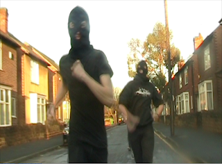
This look was not inspired by any particular  music  video but was inspired by TV shows like Top Gear, I sat in the back of a car holding a steady cam rig, we went at a speed slightly faster than the subject, this was an indie film-maker technique that i have picked up from Top Gear and other TV shows.


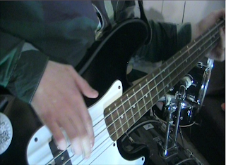
Close up's are a very common  convention in  indie/rock music videos, we wanted to follow this convention as it would make the audience see it as familiar but we wanted it it to stand out from every other music video, to do this we had the camera at canted and "odd" angles, this made it look very different from other music videos but not make the  audience feel too odd about what they are viewing 
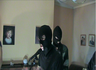
 This shot is a 180 degree pan around out lead Singer, this made the shot look much more active and interesting than if we did the shot still on a tripod, this is not a common convention in indie rock videos, i have not seen this in any indie/rock videos that i have researched.
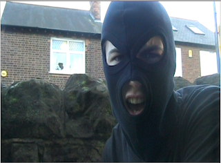
This  shot is a close up lip sync is something that is very common in indie/rock music videos, this will be very familiar for audiences but will not be the same as everything as the singer is in a balaclava and not normal  

Friday, 14 December 2012

Website Final Design

we shrunk the logo at the top of the page so that it looked better and wasn't drawing attention away from the rest of the page, we also made  better use of the space on the page, we made the size of the video and the the bar above it smaller so that we could get more into the page without making it look crammed. We also made the band images into a gallery so they would stay at a uniform distance apart, then labeled them bellow, this saved allot of space and makes the page more compact and look alot better.
We replaced the CD in the Merch store with the album we have created, this felt more fitting and allow us to link our products together, we also made the twitter feed longer and brought it up inline with the merch store so that it all looks uniform.

Now that the whole website is done it looks allot better than every iteration before, this is because of the changes we have made to make it look similar and link it all together with the black and white crime theme and having the cops and robbers theme.

Wednesday, 5 December 2012

Progress Report 30/11/12

Up to this point we have:

. Almost completed the website
. Started Digipak editing
. Shot and Edited in the performance part of the video
. Organised second shoot
. Completed planning
. Planned all ideas for shoots and album cover

Sunday, 2 December 2012

Website Banners


We have decided to change the side banners on the website from the white and blue police tape (right) to black and white to match the rest of the website. We have two versions of  the banner so far, the left one had a Black and white effect in photoshop then dropped all the blues and greens and raised the yellows and pinks and kept the reds neutral as they where not present in the photo, doing this made the banners look more natural in black and white but the the white was too dark and grainy. The second banner had the same effect applied but then a curves effect applied, i bumped up the whites to make the white look brighter, this looks better and brighter but very un-natural.

To find out which one is better we will have to make a poll and get audience feedback.


Friday, 30 November 2012

Editing summary and details of December shoot


Today we finished editing the performance side of our music video, we are planning to do our next shoot on 1/12/12 where we will be strictly focusing on the narrative side. This will be our final shoot, from then on we will be able to perfect the performance as well as adding the narrative in relation to timing.

Friday, 9 November 2012

Website Design 2

This is the banner we are using the existing band logo, we plan to make our own logo and also to replace the image with one of our band from the video.


we took inspiration from fall out boy to make band member profiles on a separate page with links using photos of each band member, we do not have the images yet as we will be taking them on shoot but we have put the links in ready.


we took ideas from the existing template to have upcoming tour dates and live feeds from the bands twitter page. We also introduced small icon links to other social sites such as facebook, twitter and youtube, we will attempt to customise the links to relate to the rest of our products