Friday, 30 November 2012

Digipak editing 30/11/12


We have started to create our ideas for our digipak ad today i have been focusing on using the images taken from the first shoot to create different parts of the digipak.

Front cover.


We decided to change our original idea to this from the two sides making up his whole face as we felt this looked better and was more easily edited into place so is simple yet effective.


We decided to align both sides of the faces eyeline and also bring down so the balaclava sits on the same line.

This is our idea for the inside cover based on previous students work and existing digipaks we have a white box as we was going to use this as the back cover but decided against this.

Editing summary and details of December shoot


Today we finished editing the performance side of our music video, we are planning to do our next shoot on 1/12/12 where we will be strictly focusing on the narrative side. This will be our final shoot, from then on we will be able to perfect the performance as well as adding the narrative in relation to timing.

Wednesday, 28 November 2012

side photo edits


we feel the blue on the police tape for the side of the website now is too bold and stands out too much, we have now decided to try and edit them to make them fit in with the grey scale theme of our website here if our first few attempts the we wish to perfect.

theses are both edits of the right side of the website and once we agree on a final edit we will apply the same to the other side.

Website design 2


Since the last post we have added the mecrch store and are trying to find appropriate images to add and made images relevant to put at the side and also changed the band bios link pictures to the members. We also changed the top image and added the band logo to be replaced by one we make ourselves we have decided to make our own band twitter feed. I also changed the text in the latest news to make it relevant to the band and website.

weather forecast for second shoot


This is the weather for Sat 1st witch is the date we want to film and the hours we wish to do so look good enough to let us film our narrative.

Sunday, 18 November 2012

Edditing 2

Today we took a second try at editing, firstly we went through and reviewed the footage that we had started on last time, we found that one clip didn't match up to the music, we found another clip that had the timings to match the music, we cut this down to size and added a very slight speed effect to it, we found that this made it flow allot more fluidly but didn't stand out as looking altered to changed to the audience.

We also did some frame removal towards the beginning and end of clips, one or two removed frames made it have a much better sync to the music

As we haven't filmed everything at this point we decided to create place holders for the narrative sections and anything we need to replace, this has made the time line easier to work on and made it a lot easier to visualize, it has also helped slightly with the problem i mentioned in the last post about when clips where deleted everything shifted, the place holders stop clips drastically jumping all over the time line.

Thursday, 15 November 2012

Editing first try

Today we started editing together our music video, we firstly went through looking at all of our footage and breaking it up into manageable clips and putting them in order as listed in our written story board, this was so that we would not get confused or mistakenly put a clip in at the wrong segment.

After we had all of our clips in order we dropped the song (Balaclava) onto the the audio track then locate the first clip that could go onto the video track, we started with the performance sections adding the the clips in one by one, we made sure that we had the music playing on the day of shooting, this made it easier to sync  the audio track with the video clips, once we had our clips lined up we went through to double check that the audio and video synced up nicely, we did this by removing a couple of frames of the clip, this made the video clips look like they actually line up with the song.

We got many of the clips in order and cut to the right length but some of them needed extra cutting to make them transition better between jump cuts of the clips, this made the whole video look better, but sadly this made everything shift to the left or right, this is a problem in Imovie that we will have to work around, we discussed how we would work around the problem, i thought that we would be able to export  the film each time and edit around the exported clips but i realized that we would still have the same problem if we needed to re-edit the exported clip.

We also found a small continuity error as we didn't film in chronological order, this was to make it easier on both the cast and crew, we had an item that was stolen for the film but was shown  in the the performance section this will have to be altered, instead of re shooting the whole performance will change the item that gets stolen 

Monday, 12 November 2012

The first shoot 10/11/12

 For our first shoot we had planed to do at least  80% of the full music video, sadly this wasn't possible because of our actors not having enough time and the posiblility of not having enough light to film outside with

Throughout the day we all took on different rolls such as cameraman director we all also had to check for continuity. In the photo above you see Corey using the camera on the steadycam rig this was his roll for that particular scene. In this scene both me and Ryan where  directing  the cast, out of shot is our written storyboard, we used this to line up the music to what visuals we would see.


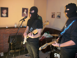
This photo is showing our band set up during the performance, the band is well lit in all the performance sections, all the light comes from two floor lights shining up on Matt (lead singer) as he is the main subject, the tall lights in the previous scene are used to light the other band members, the white light is shone directly at Simon (rhythm guitar) and the yellowish light is bounced off the wall on to Ronan (Bass) so that it is defused and not as strong.


We also took the opportunity to take band photos and individual photos for the website, we have multiple photos so that we can chose the best fit for our website


I also took the opportunity to do a first draft Photoshop for our bands CD cover  there where a few problems with this but i will cover it in a CD cover specific post.

Friday, 9 November 2012

Website Design 2

This is the banner we are using the existing band logo, we plan to make our own logo and also to replace the image with one of our band from the video.


we took inspiration from fall out boy to make band member profiles on a separate page with links using photos of each band member, we do not have the images yet as we will be taking them on shoot but we have put the links in ready.


we took ideas from the existing template to have upcoming tour dates and live feeds from the bands twitter page. We also introduced small icon links to other social sites such as facebook, twitter and youtube, we will attempt to customise the links to relate to the rest of our products

Wednesday, 7 November 2012

Website design 1


We have made a start on wix and we have started experimenting with the different tools ready for when we actual make a start on creating our website, i found some of the software very hard to use but do believe it will be a good basis to start our website from with some good templates to work from.

logistics of filming


We have decided to film on saturday the 10th of november 2012, this will give us time to do re-shoots if we need to, this date is good for both the crew and the actors


This is the wether forecast for Saturday the 10th of november 2012, the forecast is predicted to be sunny and overcast, this will be good for filming as we will get a lot of natural light, as long as it stays constant we will have good continuity.


This is a map showing directions for the crew to get to the shooting location, we have decided that this would be the best and quickest rout due to road works and the speed of the motor-way. the estimated travel time will be approximately 30 minutes 


Saturday, 3 November 2012

Previous Student digipak and website analysis


Digipak


 Overall do you like the outside covers?

yes as they are in keeping with the bands image and genre.

inside covers?

They are ok as we feel the band image is good and relates to brit rock however we feel the C.D is too busy.

How does the CD cover reflect the bands image?

The CD cover doesn't show the actual band this tells us that they are people who don't want to sell their image just the music.

how is the band promoted/sold to us?

The band is shown on the inside cover and are sold as a brit rock band, as they have the union jack in the background, They do look too boy band ish for the rest of the album theme, its also a lot brighter than the rest of the album


List the colours that are used?

The band use all the colours of the union jack throughout the entire album and website, this is a nice link to keep it is all following the same theme 

What's on the spine?

There is nothing on the spine this makes it un-noticeable in someone's CD collection, this makes the album less recognizable 

Home page


Overall is the home page good and why?

The home page is good, it has sufficient content including tour dates, social networking and merchandise to name a few features, it continues with the brit rock theme and has an appealing look

How does the home page reflect the band image?

The home page is very good at keeping up with the brit rock theme, it also has ciggerettes and alcohol all over the union jack, this is a stereotypical view of brit rock  but is also interesting.

How is the band promoted/ sold to us?

The word "BLUR" is all over the home page this keeps giving us the name of the band to sell it to us, they also have the music video playing on screen to get you into the music, this is key to getting people to buy your music, they also have links to their merchandise and spotify page to sell actual items to the audience

What text is used on the home page?

The information on the website is necessary information but is not overwhelming, the information is only used for news and the rest is images and tour dates

What colors are used?

The home page continues the theme of having the union jack  and covering it with the cigarettes and alcohol. the colours are all the same as the CD cover for example red, white and blue.


Digipak

Overall do you like the outside covers?

The outside cover is really good, it follow the idea of the album title "fiction"

inside covers?

The inside image of the band seems too "boy bandish" and doesn't fit in with the rest of the images  on the album

How does the CD cover reflect the bands image?

The CD cover doesn't show the actual band, it shows a box of brightly colored toys this leads us to believe that its pop music

how is the band promoted/sold to us?

The band don't seem that bothered about their image as they have a really relaxed attitude and on the CD photos their faces are covered with lego heads.

List the colours that are used?

They use allot of pastely colors throughout, this makes the audience see them as a bright pop group and not an indie group

What's on the spine?

The spine is very plain, it only has the album name and artist name on it, this is easy to identify by the spine alone


Home page

Overall is the home page good and why?

The home page is good by keeping within the same theme as the digipak, but seams to simple and provides little detail


How does the home page reflect the band image?

The images of the actual band makes them seem not bothered about their image as they dont look directly at the camera and all of them are looking at the floor 

How is the band promoted/ sold to us?

The band dont seam to be selling themselves in these images as it doesn't show them as a band and has no link to music 

What text is used on the home page?

Apart from links the only text on the page is the word Maccabees, this is boring for people who want quick information without having to go searching for it


What colors are used?
They use the same as on the digipak, so it makes the audiance think of them as a bright pop group and not ind

Friday, 2 November 2012

Equipment Hire List


This list allowed me to see what equipment we would need to hire for our music video, we showed this to the loans manager so that we could book the equipment we needed on time, this allowed us to have it ready for us and not wasting time 

Shooting Calendar

This allowed us to film before our deadlines to ensure that everything was completed on time but without losing quality at the expense of time

Production Schedule


Our production schedule listed all the locations and times that we need to be there, it also listed how people would arrive. It also listed what lighting and props would be required at that location. This would help us organise our shoot. Our casting list showed us all the contact details of the actors, this is incase someone doesn't show up and we can contact them.

Permission Form

We needed the permission of the actors and crew for this video so that the video could be published online and shared for others to see, we did this for legal protection so that the video couldn't be taken down by a cast or crew member.

Website Design

This is an updated and more refined version of the website design, with this it gives us a clearer idea of what we want our website to look like. i tried to include most if not all aspects of a bands website, with buttons for social networking sites as well as a uploaded video of our music video.

Thursday, 1 November 2012

Drawn story board

This allowed me to plan out and visualize how our key scenes would look in our actual music video, i could detail how everything would happen and at what time and angle, we could use this on set on production for quickly checking if we where on track.