 |
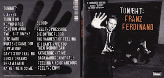
Franz Ferdinand - Tonight
This is an apropriate as it is dark and simple digipak with something unusual happening which is what we expect from an indie genre band.
The mise-en-scene is mainly based on the band wearing suits trying to look posh and professional however in the back ground something is happening that they dont want you to see witch is why the lead singer is trying to stop us looking by putting his hand up and carries onto the back with a hand behind the song titles.
As with the mise-en-scene the layout is also trying to distract your eyes from behind by having the singer set forward in the picture.Having the picture all in black and white leaves the band as a mysterious people and may make you want to buy this album to find out why they look so suspisious.
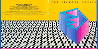
The Strokes - Angles
This is apropriateto the indie genre as it uses unusual and impossible images put together witch makes no sence, this was the same for indie bands at the time as this band is from a different era to the band we are doing. There are no mise-en-scene in this digi pack as it's all been edited together and there are no costumes
or locations apart from the random pictures of the band in the inside cover that looks to have no set image or style.
It looks to have no set layout on the outside covers and the font on the outside is very plain and basic in contrast to the crazy images behind it however on the inside covers the pictures are set in a cross and the words on the other side have been 'piled' up on eachother to form a tower and each look to have a different font but all looking like nightclub neon signs.
The image of the band isn't really clear in this digipak apart from maybe trying to show thier individualuality and to show how much they stand out. In my opinion it doesnt sell the band as well as the previous digipack.
Kaiser Chiefs - Employment
This digipak is appropriate to the kaiser chiefs image as they try to make themselves look like common working class people in there videos so they have decided to carry this on to this digipack by making it look like an old, worn out wallet.
I believe ther is no mise-en-scene apart from trying to make the hole album look like worn out, dirty, second hand thing like a wallet.
The title and name of the artist is in the centre of the front and on the back cover the font is very simple so it is easy to read the song title set out under eachother.
This digipack is trying to sell the band the same way as there music videos try to. Trying to make the band seem like 'one of us' and just normal people.
Kasabian - Veloceraptor
This is an appropriate digipak for a rock indie band as it unusual as it duplicates one of the band members faces in each corner in very dark and dull colours.
This digipak has no clear mise-en-scene as there is no location, costume only the band member screaming or 'roaring' to complement the name of the album 'veloceraptor'.
The C.D and the front cover have a circular layout with all the face looking at eachother with the title centered in the middle in small and clear font so to not distract you from the imagery.
The digipak trys to seel the band as unique idividuals in a sort of 'organised choas'
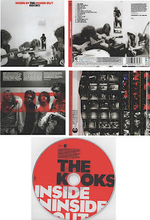
The Kooks - Inside in Inside out
This is an apropriate digipak as it is very plain simple as it is all black, white and red and doesn't change throughout and all peices of the digipak all have images of the band on them.
The two main images look to be set in a blank white room with keeping the album simple and all the costumes of the band is the same but look just to be casual, what we expect from an indie rock band.
There looks to be not set layout and looks disorganised, the font is small and very plain and simple as though it's there to read but it's not important.
The band is being promoted by being shown all over this digipak, i gives the buyer a look and insight to the band without showing much of the band.
Our Band
We intend to make our digipak appropriate by keeping to genre conventions by having a dark and gloomy cover flowing through the whole digipak, we aim to do this without much mise-en-scene only focusing it it on the balaclava.
The layout of our digipak will be simple with the main image on the front being centered and the the title in a convenient place so it is easily read but not taking the attention away from the image. The font will be simple and easy to read throughout giving the digipak a casual feel in keeping with the bands image.
we intend to sell our band mainly through the image of the lead singer on the front, this and the rest of our ideas are similar to arctic monkeys previous work such as 'whatever people say i am, I'm not.'


No comments:
Post a Comment